Read on ...
There is an old saying that the camera never lies. Well when it comes to colour it most certainly does. Amongst the lenses you use, the medium you record on, the exposures you make, the processing you undertake and thousand other variables colour is what you make it and bears little resemblance to what was in front of you when you made you picture. In fact it can't help but do so.

Amongst the all the variables that affect colour like the lenses you use, the medium you record on, the exposures you make, the processing you undertake and loads of other stuff then colour is ultimately what you make it and bears little resemblance to was in front of you when you made your picture.

Above is the original image taken on Kodak Portra 800 with a Leica Summarit-M 90mm f2.4 on a Zeiss Ikon ZM rangefinder camera. The exposure was f8 at 1/500s. The film was processed and scanned by C41.co.uk, who used a Noritsu HS-1800 films scanner at high resolution to create an 30mb image from the developed negative. This is image is most likely as close to how the camera system and film captured the scene at the time - ish.

The image above was created by the PerfectlyClear "Essentials Outdoor" preset which provides a bright high contrast, high saturation look that boosts skies and foliage. This is more in line with how I saw the scene at the time and how I remember it in my minds eye so to speak.

The above image is the result of then applying the PerfectlyClear "Double Dip Film Stock" look to the Outdoor image which deepens colours and shifts the black point making it somewhat reminiscent of a cross processed slide film.
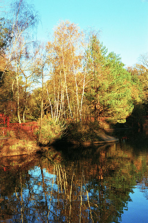
Lastly, the image above is the result of applying the PerfectlyClear "Warm Film Stock" look to the "Outdoor" image which further boosts colour vibrancy and overall contrast giving a look of good old super saturated "chrome" slide films of yore.
Which leaves us where? Well colour preference is, as ever, totally subjective and in the eye of the beholder. Which of the colour palettes in the four images above do you prefer or indeed even like, if any? To me they all have their appeal and speak to different moods and feelings. As to which is best? Well, all and none - it depends..
Thus cameras (and the colour process associated with them to be more precise) produce colourful lies as they don't see the world as we do nor indeed as we might like to ourselves nor indeed as we might like others to, it's all a matter of perception. Weird isn't it?